
How to Plot a Graph in MATLAB
MATLAB is one of the more complex numerical computing and programming platforms. Getting to know MATLAB involves understanding various mathematical concepts, and learning how to plot a graph in MATLAB is one of those concepts at play.
Whether you’re learning about MATLAB for the first time or want a refresher, here’s a brief tutorial on plotting graphs, as well as adding labels and a title, plotting lines, scaling on the graph, and more.
Let’s get started.
Plot a Function Graph
Here’s a step-by-step guide on how to plot the graph of a function with a script. To create a new script, select the icon in the top left corner to begin.
Screenshot: Create a script in MATLAB 2019a
Step 1: Specify the Range of Values for the x variable for which you’re plotting the function. This will define x.
Specify the range of values as a linearly spaced vector with the “linspace” function. The syntax follows the format below:
x = linspace(x1,x2,n)
The “linspace” function generates “n” number of points between x1 and x2. The distance between the points can be calculated with the equation (x2-x1)/(n-1).
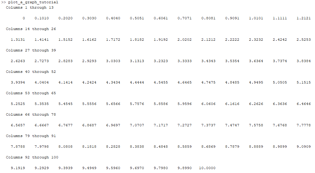
For example, the following code will have a distance of (10-0)/(10-1)=1.1111 between each point and have 10 points between 0 and 10.
x = linspace(0,10,10);
x has the following values in this sample:
![]()
Having too few points will result in graphs that are inaccurate. Plotting the function y=sin(x) with the range of values set as linspace(0,10,10) would result in the figure below:
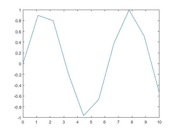
MATLAB Figure: sin(x) with only 10 values plotted
However, if linspace(0,10,100) is used to generate 100 points instead of 10, the figure below is produced.
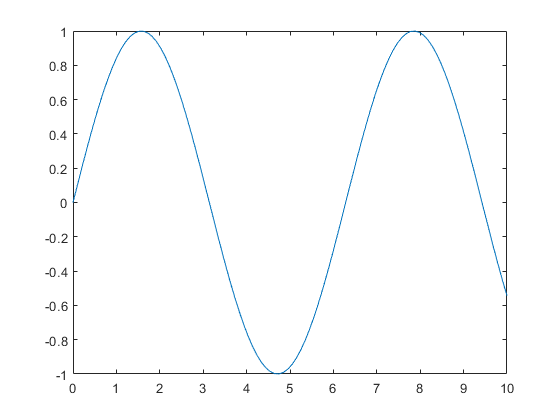
MATLAB Figure: sin(x) with 100 values plotted
If your graph isn’t a smooth plot, it’s likely that the number of points needs to be increased.
Step 2: Define the function, y = f(x)
Declare the desired function with the “=” operator. Any variable name can be used in place of “y”, however “y” is often the standard. Declare an exponential function using the following expression.
y=exp(x);
Step 3: Use the plot function to generate a figure
Use the function “plot” to create a 2D line plot of the function declared in Step 2. The function has the following syntax, where Y is plotted with the corresponding X values. A new window will open with the figure.
plot(X,Y)
Use the code below to plot y = ex.
x = linspace(0,10,100); %create a set of X values to pass through the function
disp(x); %display the values to the command window
y=exp(x); %declare the exponential function
plot(x,y) %plot the function
The command window output is below:
The following figure will be generated in a new window.
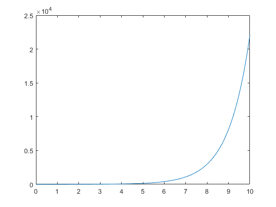
MATLAB Figure: exp(x) with 100 values plotted
Add a Title, Labels, and Grid Lines
MATLAB lets you add a title, labels along the x and y axes, as well as grid lines to make graphs more detailed.
Here’s how to do all of the above:
Step 1: Use the functions xlabel, ylabel, and title to generate labels along the axes.
The function xlabel, ylabel, and title use the syntax below.
xlabel(txt) - This function labels the x-axis of the currently selected axes or of the standalone visualization.
ylabel(txt) - This function labels the y-axis of the currently selected axes or of the standalone visualization.
title(titletext) - This function adds the designated text to the current axes or to the standalone visualization. A subtitle can also be selected with the syntax subtitle(txt).
Run the following script to create a plot with titles.
x = linspace(0,10,100); %create a set of X values to pass through the function
y=exp(x); %declare the exponential function
plot(x,y) %plot the function
title('Sample 2-D Line Plot');
xlabel('Time (h)');
ylabel('Number of Bacteria');
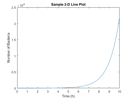
MATLAB Figure: exp(x) with titles
Step 2. Display grid lines
Use the “grid on” function to turn on major gridlines.
grid on;
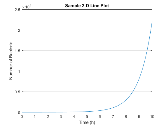
MATLAB Figure: exp(x) with major gridlines
Use the function “grid minor” to turn on minor gridlines.
grid minor;
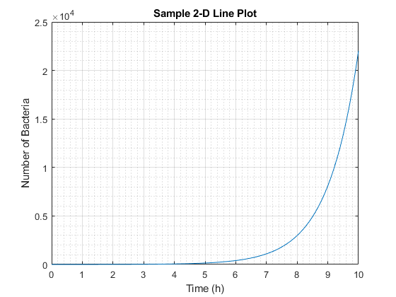
MATLAB Figure: exp(x) with minor gridlines
You can also change where the gridlines appear by using the function “xticks(ticks)” and “yticks(ticks)”. The ticks values are specified as a vector of increasing values.
Vectors can be created with the colon operator in MATLAB using the following syntax, x = j:i:k, where a regularly-spaced vector denoted as “x” is created with increment “i” and an ending value of “k”.
The following yields the figure below:
x = linspace(0,10,100); %create a set of X values to pass through the function
y=exp(x); %declare the exponential function
plot(x,y) %plot the function
title('Sample 2-D Line Plot');
xlabel('Time (h)');
ylabel('Number of Bacteria');
grid on;
xticks(0:2:10); %start at 0, increment by 2, and end at 10
yticks(0:10000:25000); %start at 0, increment by 10000, and end at 25000)
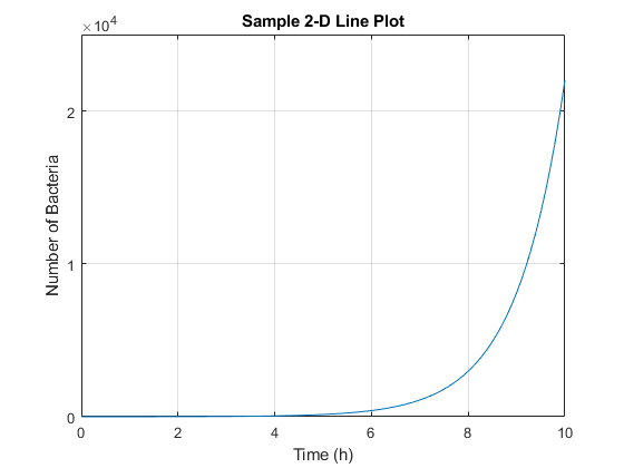
MATLAB Figure: exp(x) with manually selected x and y axes
Set Axis Scales
The axis function lets you set the scales for both axes with minimum and maximum values for each axis. This function uses the syntax axis([xmin xmax ymin ymax]). Run the code below to plot a graph with 50 as the maximum y-axis and 10 as the maximum x-axis. Negative numbers can also be selected.
x = linspace(0,10,100); %create a set of X values to pass through the function
y=exp(x); %declare the exponential function
plot(x,y) %plot the function
axis([0 5 0 50]); %x-axis limit is from 0 to 5, y-axis limit is from 0 to 50
title('Sample 2-D Line Plot');
xlabel('Time (h)');
ylabel('Number of Bacteria');
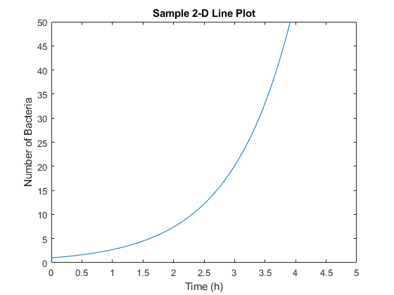
MATLAB Figure: exp(x) with major gridlines
Draw Multiple Functions
You can even draw more than one graph on the same plot or create subplots to display multiple plots at once.
Use the function “hold on” to retain the current plot. Always add a legend to differentiate between the lines on the graph using the function “legend(label1,...,labelN)”. The following script yields the plot below.
x = -pi:0.1:pi; %set x-axis values to start at -pi, increment by 0.1, and end at pi
y1 = 50*sin(x); %declare the first function
y2 = 50*cos(x); %declare the second function
y3= tan(x); %declare the third function
hold on; %retain plots on the graph
plot(x,y1); %plot the first function
plot(x,y2); %plot the second function
plot(x,y3); %plot the third function
hold off; %stop retaining the figure
title('Multiple Plots on a Singular Graph');
legend('50*sin(x)','50*cos(x)','tan(x)'); %create a legend in the order that the functions were plotted
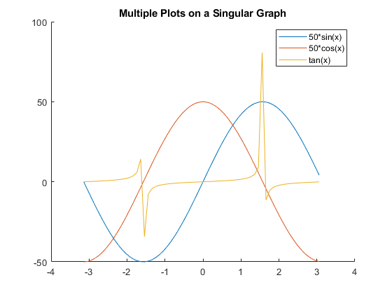
MATLAB Figure: Multiple plots on the same graph
In addition, you can use the “subplot(m,n,p)” function to display multiple plots on multiple graphs, but in the same figure. In this function, “m” refers to the row of the figure, “n” represents the column, and “p” is the pane.
x = -pi:0.1:pi;
y1 = 50*sin(x);
y2 = 50*cos(x);
y3= tan(x);
ax = axes;
subplot(2,2,1); %there are 2 rows in the subplot and 2 columns, plot in the first pane starting from the top left
plot(x,y1,'red');
title('50*sin(x)');
subplot(2,2,2); %plot in the second pane
plot(x,y2,'blue');
title('50*cos(x)');
subplot(2,1,2); %plot in the first column and fill to the second pane
plot(x,y3,'black');
title('tan(x)');
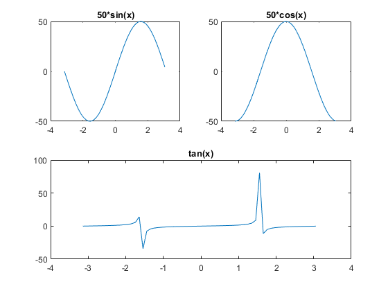
MATLAB Figure: Multiple plots on the same figure
Set Colors on a Graph
MATLAB offers eight colors that can be chosen by color name or by the shortened name in the table below.
|
Color Name |
Short Name |
|
red |
r |
|
green |
g |
|
blue |
b |
|
cyan |
c |
|
magenta |
m |
|
yellow |
y |
|
black |
k |
|
white |
w |
As well, you can designate custom colors by RGB triplet or by hexadecimal color code (with MATLAB version R2019a and above).
RGB triplets are declared using a three-element row vector “[red green blue]” where the elements correspond to the intensity of the red, green, and blue components of the custom color. The intensities are in the range between zero and one. For example, a shade of purple would be [0.5 0 0.5]. Some functions do not support RGB triplets.
x = -pi:0.1:pi;
y1 = 50*sin(x);
y2 = 50*cos(x);
y3= tan(x);
ax = axes;
hold on;
plot(x,y1,'red'); %plot in red
plot(x,y2,'blue'); %plot in blue
plot(x,y3,'k'); %plot in black with the short name
hold off;
legend('50*sin(x)','50*cos(x)','tan(x)');
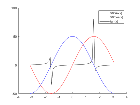
MATLAB Figure: User designated colors
Conclusion
Starting out with plotting in MATLAB can be overwhelming if you’re not familiar with programming. MATLAB uses its own proprietary programming language but has similarities with C. Check out MATLAB’s documentation for more in-depth and specific functions.
If you’re looking to learn basic and advanced design in MATLAB or want to teach yourself how to code or prepare for finals, subscribe to high-quality online tutoring at 24HourAnswers today!