The Hertzsprung-Russell Diagram
Homework Help & Tutoring
We offer an array of different online The Hertzsprung-Russell Diagram tutors, all of whom are advanced in their fields and highly qualified to instruct you.


The Hertzsprung-Russell Diagram
The Hertzsprung-Russell Diagram
One of the unique and amazing aspects of astronomy is that we are able to study objects that are located so far away that travel to them will never be practical and some that are so far away that they do not even exist any more. They may have exploded as a supernova, but the light from that explosion has not even had time to reach us, so it appear that they are still happily going through their lives.
The closest star to our Sun is Proxima Centauri – over 4.2 light years away from Earth. To put that in perspective, imagine that you could drive in your car at 60 miles per hour non-stop through space. It would take you 6 months to reach the Moon, 200 years to reach the Sun, 6,000 years to reach Neptune, and over 52 million years to reach Proxima Centauri, our nearest neighbor! Even at the speed of the fastest spacecraft humans have ever produced, the New Horizons Probe which flew by Pluto at a speed of over 36,000 miles per hour, it would take over 77,000 years to reach Proxima Centauri.
However, despite these enormous distances, astronomers have learned enormous amounts about the properties of stars, including their luminosity (i.e. the amount of energy they emit each second), their surface temperature, and their mass. Please refer to this Technical Article for more information on each of these properties of stars and how they are measured. In the early 1900s, Ejnar Hertzsprung and Henry Norris Russell developed a graphical way of presenting the properties of these stars. This visual representation is now called the Hertzsprung-Russell (HR) diagram.
Whether you are in an introductory astronomy class, an astrophysics class for astronomy and physics majors, or in graduate school, you will encounter the HR diagram. Getting confused by what the diagram tells you? Want a little guidance in how to use the diagram to its full benefit? Let our trained astrophysicists here at 24houranswers.com help you. Don’t struggle alone – we are here to assist!
What Does The Hertzsprung Russel Diagram Show?
The HR diagram’s power lies in that it shows the relationships between different properties of stars and determines that it is not random – there are connections between the temperature of a star and its luminosity or its mass. Additionally, the HR diagram shows the evolution of stars during their lifetimes and how the properties of these stars change from the beginnings of their lives as main sequence stars until their eventual end as white dwarfs or as supernovae explosions.
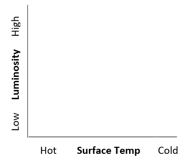
The Basic HR Diagram Setup
In all forms, the HR diagram is a two-dimensional graph that represents a star’s surface temperature along the horizontal (or x) axis and a star’s luminosity along the vertical (or y) axis. Take a look at the axes of the HR diagram below. You will see luminosity on the vertical axis and surface temperature along the x-axis. However, notice a couple of important things about the way that these properties are plotted. Luminosity is plotted like one would normally expect. The highest luminosity stars are found to the top while the lowest luminosity stars are found to the bottom. Surface temperature, however, is backwards from what you might expect. The hottest stars are found to the left, while the coldest stars are found to the right – the numbers go from high to low. This discrepancy occurs because the original HR diagrams by Hertzsprung and Russell did not plot numerical values for the surface temperature. Instead the plots showed the spectral type of each star (see Properties of Stars Technical Article for more detail on spectral types) plotted from O stars (the hottest) all the way through to M stars (the coldest). Even though most HR diagrams now give numerical values for the surface temperature, the pattern has remained with the hottest stars being to the left and the coldest stars to the right. Be sure to keep this fact in mind – it has certainly tripped up many a student when asked to interpret the HR diagram.
There are many different ways that the surface temperature and luminosity axes can be structured. For surface temperature the choices are normally the actual surface temperature in Kelvin or the spectral type of the star from O to M. Be careful because even when the axis shows the actual temperature of the star, the numbers along the axis may not be linear. If they are linear then there are equal distances along the axis for equal differences in temperature. In other words, if the axis is 1 inch from 20,000 K to 15,000 K, a difference of 5,000 K, then it will also be 1 inch from 15,000 K to 10,000 K. Sometimes, instead of being linear with temperature, the possible spectral types of the stars are spaced equally along the axis and then the temperature corresponding spectral type is listed on the axis. This results in a non-linear distribution of surface temperatures along the horizontal axis because surface temperatures are not linear with spectral type. There is a greater difference in temperature between an O star and a B star, for instance, than there is between a K star and an M star. For example, an O9 star has a surface temperature of 36,000 K compared with 10,600 K for a B9 star, a difference of over 25,000 K. In comparision, a K5 star has a surface temperature of 4,500 K and an M5 star has a surface temperature of 2,500 K, only a difference of 2,000 K between the spectral types. In most cases, however, the exact numbers represented on the HR diagram are not that important. What is normally more critical is the relative temperature of the star (i.e. is it hotter or colder than a different star on the diagram). The vertical axis, similarly, has a number of different ways to distribute the values for the luminosity of a star. Probably least common is a linear distribution. This is because there are even larger differences between the luminosities of stars than between their surface temperatures. For example, a low luminosity star like Proxima Centauri has a luminosity that is 0.17% of our Sun’s luminosity. In comparison, one of the most luminous stars, R136a1 has a luminosity that is more than 8.5 million times the Sun’s luminosity or 5 billion times the luminosity of Proxima Centauri.
Any linear distribution along the axis would make it impossible to show the differences in luminosity between stars like our Sun and low luminosity stars and instead would only highlight the highest luminosity stars. Therefore, most HR diagrams have a vertical axis for luminosity that is logarithmic. In other words, there is an equal distance on the axis between each power of 10 of luminosity. So, if there is one inch between 1 solar luminosity and 10 solar luminosities there will also be one inch between 10 solar luminosities and 100 solar luminosities, between 100 solar luminosities and 1,000 solar luminosities and so forth. This kind of axis allows the user to see the differences not only between high luminosity stars but also low luminosity stars as well.
Some HR diagrams do not technically plot luminosity at all on the vertical axis. Instead, they plot the absolute magnitude of the star. Absolute magnitude is a scale that shows the luminosity of a star. For absolute magnitude the smaller the number, the higher the star’s luminosity is. Absolute magnitude is logarithmic by design, so differences can be seen between all different luminosity stars. In general, every difference in 2.5 in absolute magnitude between stars corresponds to 10 times more luminosity for the higher luminosity star. Keep in mind that since luminosity is always plotted with the higher luminosity to the top of the HR diagram, then for absolute magnitude, the smaller absolute magnitude values (often these are large negative numbers since large negative numbers are smaller than small negative numbers or positive numbers) are found at the top of the vertical axis.
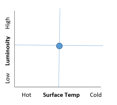
How do we represent stars on the HR diagram? Consider the HR diagram below. Every star has a surface temperature and also a luminosity. Imagine a vertical line coming up from the surface temperature of the star and a horizontal line going across from the luminosity of the star. Where those two lines cross is where the star is on the HR diagram, so we can represent the star by a single point at that location. For any star on the HR diagram, simply go down and you will find the star’s surface temperature and go to the left and you will find its luminosity.
What happens to the HR diagram when we start to add in stars? Before we can answer this question, we need to first understand how we get the data to put a star on the HR diagram in the first place. The properties of stars are discussed in much more detail in a companion article on this website, but to quickly summarize, the surface temperature we can determine by finding the spectral type of a star. To do this we look at a spectrum of a star and examine the strength of various absorption lines, compare them with template or sample stars, and determine the spectral type of each star. The spectral type then directly tells us the surface temperature of the star. Determining luminosity is a little trickier. Luminosity is the total amount of energy emitted by a star each second. While this may seem straightforward consider this daily life example. You see two streetlights – one looks very bright and one looks very faint. What is the most likely reason that one looks bright and one looks faint? It could be that they have different luminosities – in other words one might have a 200 W lightbulb while the other has a 50 W lightbulb inside. However, more likely than not they have the same luminosity lightbulb and the faint streetlight is located farther away than the brighter one. How does this translate to stars? We can easily measure the brightness of star (i.e. how much light from the star we receive here on Earth). However, to figure out what the luminosity of the star is, we must know its distance. If we know the distance and the brightness, then fairly straightforward math leads us to the total luminosity. Ways to measure distance are discussed more in the Properties of Stars article, but the important part for our discussion here is that we are limited in how far away we can accurately measure distances. Even with the best space telescopes used for this purpose, we have only been able to measure distances out to approximately 20,000 light years (and that is only for the brightest stars out there). More realistically we can measure distances to stars quite accurately only if they are located within approximately 1000 – 2000 light years from Earth.
Let’s start adding thousands of stars to our HR diagram to see what patterns, if any, emerge. Consider the following picture
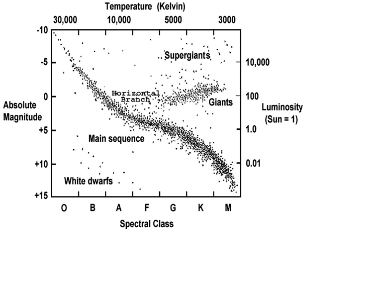
(https://chandra.harvard.edu/graphics/edu/formal/variable_stars/HR_diagram.jpg)
Each dot on this diagram represents the luminosity and temperature of an actual star in close proximity to our solar system. This diagram also shows quite well the different ways that the axes of the graph can be labeled, with surface temperature in Kelvin at the top and spectral class at the bottom and absolute magnitude on the left and luminosity compared to our Sun plotted logarithmically on the right. Here are a few quick observations that we will then examine in more detail:
- Most stars lie along a diagonal line from the top left of the HR diagram to the bottom right. This line represents what are called main sequence stars, which make up about 95% of all stars in space.
- To the upper right of the main sequence we find another bunching of stars that are labeled giants and supergiants. These stars are ones that have lower temperatures (and therefore are red) but higher luminosities. The only way this can work is if the star is quite large in diameter, which is why these are commonly referred to as red giants or red supergiants.
- To the bottom left of the main sequence is a third bunching of stars that are labeled white dwarfs. These stars are effectively the opposite of giants, at least as far as their properties go. They are hotter stars (therefore the white part of their name since a true white star is one that is even hotter than a blue star) and also lower luminosity. The only way that this can work is if they are quite small in diameter. In fact, the average white dwarf is about the physical size of Earth – more than one million times less volume than our Sun.
- As a side note to the discussions of white dwarfs and giant stars – these represent future stages in the life of a star like our Sun. Our Sun is currently a main sequence star but will (in approximately 5-6 billion years from now) become a red giant, a red supergiant, and then a white dwarf.
Main Sequence Stars
The HR diagram, while very useful for all types of stars, is particularly insightful for main sequence stars. Before we get into what the HR diagram tells us about main sequence stars, first let’s look at what exactly a main sequence star is. A main sequence star is defined as a star that is producing energy through hydrogen fusion in its core. All stars make their energy through fusion (i.e. combining lighter elements into heavier elements and converting any mass lost during the fusion process into energy). Main sequence stars make their energy through hydrogen fusion, which involves merging 4 hydrogen atoms into 1 helium atom. Fusion does not occur easily. You could fill a huge balloon with hydrogen gas and it will NOT suddenly start making helium. Hydrogen atoms are effectively single protons, which each carry a positive charge. Like charges have a repulsive force between them, so two protons will not naturally combine together to start making helium. The only way to get them to fuse is for the protons to be going so quickly that the repulsive force is not enough to stop them from combining. An analogy would be when traffic has suddenly come to a stop ahead of you. You slam on the brakes (the repulsive force between protons) which slows you down, but if you are going too quickly you will still end up hitting the car in front of you (the fusion process).
For gasses, faster speeds come from higher temperatures. In order to have protons moving fast enough to overcome the repulsive force between them and merge, temperatures of approximately 10 million Kelvin are needed. These hot temperatures do not occur naturally on Earth and in fact do not occur naturally throughout most of a star. For example the surface temperature of a star like our Sun is only 5500 K, far short of 10 million K. As you go deeper into a star the density and temperature rise, and eventually there will be a region at the center of the star that is over 10 million Kelvin and therefore able to undergo hydrogen fusion. This central area is called the core of the star, and for a star like our Sun is only approximately the inner 20% of the star’s radius. Eventually when stars become giant stars they will begin hydrogen fusion outside the core and also fuse elements other than hydrogen inside the core, but for main sequence stars they only have hydrogen fusion and that hydrogen fusion only occurs in the core. Since hydrogen fusion in the core requires the lowest temperatures, main sequence stars are also the first part of a star’s life. The moment it becomes hot enough for any sort of fusion to begin, it becomes a main sequence star with hydrogen fusion in the core.
As the HR diagram above indicates, main sequence stars are quite common. In fact, 95% of all stars are main sequence stars. Part of the reason for this is that stars spend the vast majority of their lives (approximately 90%) as main sequence stars. The main sequence lasts longer in large part because hydrogen fusion in the core is by far the most efficient fusion that the star will undergo. It produce the most energy and uses the least mass in the process as well. As an example our Sun will spend a total of approximately 10 billion years as a main sequence star with hydrogen fusion in the core compared with only 1 billion years as a red giant or 100 million years (1% of its main sequence life) as a star with helium fusion in its core. How are different mass stars different? In general, the heavier a star is the faster it goes through its life. For example, a star that is ten times heavier than our Sun will only spend 20 million years as a main sequence star, approximately 0.2% of our Sun’s main sequence lifetime.
The distribution of main sequence stars on the HR diagram, however, is not completely random. Main sequence stars lie along a diagonal line going from the upper left (i.e. hot stars with higher luminosities) to the lower right (i.e. colder stars with lower luminosities). This tells us that there is a connection for main sequence stars between their surface temperature and their luminosity – it is not random. In fact, for main sequence stars, the hotter a main sequence star is, the higher its luminosity will be as well. For example, consider the brightest star in the sky: Sirius A. Sirius is an A1 spectral type blue-ish looking main sequence star. Since A1 stars are hotter than G2 stars (which our Sun is), and since our Sun and Sirius A are both main sequence stars, we can immediately say that Sirius A will have a higher luminosity than our Sun. In comparison, the closest star to our Sun, Proxima Centauri, is an M5 main sequence star, which means it is much redder and cooler than our Sun. As a result we can also say that its luminosity will also be substantially lower than our Sun, and in fact, Proxima Centauri is such low luminosity that even though it is the closest star to us it can NOT be seen with the naked eye from Earth.
Are there other trends for main sequence stars beyond luminosity and surface temperature? A third key property of stars is their mass. Mass is also not randomly distributed when it comes to luminosity or surface temperature of main sequence stars. Main sequence stars that are heavier are also hotter. This is likely no surprise – a heavier star has more gravity pulling it in. The only way that a star resists the collapsing pull of gravity is to make energy. The energy that is made in the core of the star creates a pressure pushing outward from the center as the energy escapes from the core of the star, and this pressure exactly balances out the gravitational force trying to collapse the star, creating a form of equilibrium. A heavier star has more gravitational force trying to collapse it, which means more force is needing from energy being made. Therefore heavier main sequence stars must produce more energy than lighter main sequence stars. This is powerful information about a main sequence star’s mass that we can learn simply from its place on the HR diagram. Sirius A, the A1 main sequence star discussed above, is hotter than the Sun, which means it is also heavier than our Sun. In fact it weighs approximately 2 solar masses. In comparison, Proxima Centauri, a cooler and lower luminosity main sequence star compared to our Sun will weigh less than our Sun. It only weights 0.12 solar masses or 12% of our Sun’s mass. For main sequence stars, think of it as the rule of the 3 H’s. Main sequence stars that are Hotter have a Higher luminosity and are Heavier. See this version of the H-R diagram for more specifics about the mass relationship to temperature and luminosity.
There is also a fourth related property for main sequence stars beyond the star’s luminosity, surface temperature, and mass. This property is the physical size (i.e. radius or diameter) of the star. The connection between mass and radius is not necessarily obvious for main sequence stars. Yes, stars that are heavier have more material so should be larger, but then they also have more gravity trying to pull them in, so that could make them smaller instead. Keep in mind that since stars are in equilibrium they have the pressure created by energy made in the core working its way out to the photosphere or surface of a star. This outward pressure means that even if gravity is stronger for a heavier star it does not mean that gravity will win and make the star smaller. The opposite in fact is true and for main sequence stars, the hotter a star is (or equivalently the higher luminosity it has, or the higher its mass), the larger in radius or diameter the star is. The difference is not that extreme. Sirius A, which is two times heavier than our Sun, has a radius that is 1.7 times the radius of our Sun. In comparison, Proxima Centauri, which weighs only 12% of our Sun’s mass has a radius that is 0.15 times or 15% of our Sun’s radius. While I know it is not technically a word, we can add the physical size relationship to the rule of the 3 H’s to make it the Rule of the 4 H’s for main sequence stars. Main sequence stars that are Hotter have a Higher luminosity, are Heavier, and are also Huger (i.e. larger in radius or diameter). The differences in radius between heavy stars and lighter stars might seem substantial (and they are), but they are nothing compared to the differences in diameter that we see when we start considering the stars that are in other parts of the H-R diagram, in particular giants, supergiants, and white dwarfs. See this diagram for more on the diameters of stars and pay particular attention to the giants and white dwarfs, which we will discuss next.
Giants and Supergiants
Let’s spend a little bit of time looking at the other 5% of stars on the HR diagram that are NOT found on the main sequence. First consider the stars in the upper right portion of the HR diagram. These are labeled, in the figure above, as giants and supergiants. As discussed above, these are stars that are on the lower side when it comes to surface temperature; thus, the “red” that often is attached to these star types to call them “red giants” and “red supergiants”. They are also high luminosity, with as much energy emitted as the hottest and heaviest main sequence stars and in some cases even more energy than these stars. One key note with stars is that they are considered blackbodies. As a result, not only do their colors indicate the temperatures at the surface or photosphere of the star, but also the color helps to indicate how much energy is being emitted from each part of the star. In general, stars that are hotter (i.e. bluer) emit more energy for every square meter of surface area than stars that are cooler (i.e redder). How, then, can a star be cooler (and redder) yet have such a large luminosity? If this star was the same physical size as a blue star then it would be emitting much less energy total. The only way for the cooler star to catch up in how much energy it emits is if it has a large surface area (i.e. it has a large radius or diameter). This means the stars must be larger in diameter, which is why they are called giant and supergiant stars. Aldebaran, the brightest star in Taurus and often seen as the red eye of the bull, is a classic example of a red giant star. It has a K5 spectral type, which puts it in the cooler range with a surface temperature of 3,900 K. However, its diameter is 44 times the diameter of our Sun. To put this in comparison, Mercury is at a distance that is 42 times the diameter of our Sun (or 84 times its radius), which means that if our Sun were replaced by Aldebaran, Aldebaran would reach half way to Mercury. In this situation if we were on Earth, Aldebaran would be more than 20o angular size which means that it would be over 40 times bigger in the sky than it is now and would be roughly the same as two fists next to each other held arms length in front of you. This huge radius means that the luminosity of Aldebaran is much larger than the luminosity of our Sun. In fact, Aldebaran’s luminosity is 439 times our Sun’s luminosity.
Aldebaran, however, is just an example of a giant star. Supergiants are even larger in diameter and higher in luminosity. Betelgeuse, the alpha star of Orion, is a classic example of a red supergiant. It has a spectral type of M1 to M2, which makes it even cooler than Aldebaran, coming in at a surface temperature of 3,600 K. However, the diameter of Betelgeuse is estimated to be 955 times the diameter of our Sun. This means that you could fit 955 Suns across Betelgeuse and 871 million Suns inside of Betelgeuse. For comparison, our Earth is located 216 solar radii away from the center of our Sun. What that means is that if our Sun was replaced by a red supergiant like Betelgeuse, we wouldn’t be here to see it. Why not? The reason is that the new star would have completely swallowed up not only Mercury and Venus but also Earth. While Jupiter would not be swallowed up, at a distance of 1,118 solar radii from the Sun it would be very close to being swallowed up (and there are some red supergiant stars that are even larger that would in fact swallow Jupiter). If somehow you could survive living on Jupiter or one of its moons in this scenario, the red supergiant Sun would take up 97o of angular size in the night sky, which is essentially more than half of the sky itself. Such a large diameter also leads to a very high luminosity, and Betelgeuse has a luminosity that is approximately 120,000 times the luminosity of our Sun. We will discuss in a future article about the evolution of stars exactly why giant stars and supergiant stars swell up so dramatically and increase in luminosity so many times, but for now a short answer is that these stars do not have fusion occurring in the core of the star. The core is not hot enough for the helium or carbon in the core to fuse to heavier elements. Instead, the fusion is occurring in a shell just surrounding the core and this placement of the energy production creates a substantially larger radiation pressure than a main sequence star (or even a horizontal branch star) which has fusion in the core. This increased radiation pressure from the energy being made outside the core causes the star to swell up and expand to its tremendous size. A final note on giants and supergiants – our Sun will in fact one day become a red giant and then a red supergiant, so part of Earth’s fate is in fact to be swallowed up by our expanding Sun as it is becoming a red supergiant. This is a fate that we will have to face in the future, although granted it is the distant future – more than 5 billion years from now.
White Dwarfs
Speaking of our Sun’s fate, at the very end of its life our Sun will become a white dwarf. White dwarfs are found at the bottom left of the HR diagram. What does that tell us about them? The fact they are to the left means that they have a high surface temperature and are blue or white in appearance. The fact that they are near the bottom tells us that they have a low luminosity. For example, one of the closest white dwarfs to us is called Sirius B. Sirius may sound familiar from earlier in this article. It turns out that the brightest star in the sky besides the Sun, called Sirius, is in a binary system with a white dwarf, which is called Sirius B. Sirius B has a surface temperature of 25,000 K but a luminosity that is only 5.6% of the Sun’s luminosity. How can an object that is very hot at the surface have such a low luminosity? Consider this the opposite of a giant or supergiant star. To have a hot temperature but a low luminosity means that the white dwarf must have a small physical size. In fact the diameter of Sirius B is only 0.8% of the Sun’s diameter. To put that in perspective, the Earth’s diameter is 0.9% of the Sun’s diameter, which means that Sirius B is about the same size and in fact slightly smaller than the Earth. Consider this however: Sirius B has a mass that is almost identical to the Sun’s mass. That means that a whole Sun’s worth of mass is condensed into a volume that is the same as the Earth. White dwarfs are very dense indeed. We will discuss white dwarfs more in an article about the life of stars, but here are some quick highlights about white dwarfs. White dwarfs actually do not have fusion occurring inside of them – they are made of carbon and the temperatures inside the white dwarf are not high enough for carbon to fuse. However, we do see them in the sky because they are glowing due to their hot temperatures, even if they aren’t producing energy by fusion. However, this glowing will not last forever. Just as a piece of charcoal glows and then slowly fades away, a white dwarf too will cool down and slowly fade away. This process takes billions of years however.
Conclusion
In this article we have discussed the basics and the intricacies of the HR diagram. The HR diagram is a powerful tool that can tell us a tremendous amount of information about a star and its properties. Beyond allowing us to identify whether a star is a giant, a white dwarf, or main sequence star, the HR diagram helps us to build concrete connections between the properties of stars, especially main sequence stars. If you have questions about the HR diagram, whether you are in an introductory astronomy class or an advanced level class or just interested in astronomy, we are here to help you at 24houranswers.com. Don’t struggle on your own – let us make the HR diagram straightforward for you!
Why students should use our service
As you tackle any of your astronomy assignments, remember our tutors are available to help every step along the way. We have highly qualified tutors who can help you with the HR diagram or any level of astronomy. We offer this help either through live tutoring or through writeup deliverables.
24HourAnswers has been helping students as an US-based online tutoring business since 2005, and our tutors have worked tirelessly to provide students with the best support possible. We are proud to be A+ rated by the Better Business Bureau (BBB), a testament to the quality support delivered by our tutors every day. We have the highest quality experts, with tutors from academia and esteemed institutions such as the Massachusetts Institute of Technology (MIT).
Our astronomy online tutors are available anytime to offer astronomy assignment help or guide your understanding and mastery of your astronomy coursework. For any astronomy-related challenge—big or small—bring us the question, and we have the answers!
College The Hertzsprung-Russell Diagram Homework Help
Since we have tutors in all The Hertzsprung-Russell Diagram related topics, we can provide a range of different services. Our online The Hertzsprung-Russell Diagram tutors will:
- Provide specific insight for homework assignments.
- Review broad conceptual ideas and chapters.
- Simplify complex topics into digestible pieces of information.
- Answer any The Hertzsprung-Russell Diagram related questions.
- Tailor instruction to fit your style of learning.
With these capabilities, our college The Hertzsprung-Russell Diagram tutors will give you the tools you need to gain a comprehensive knowledge of The Hertzsprung-Russell Diagram you can use in future courses.
24HourAnswers Online The Hertzsprung-Russell Diagram Tutors
Our tutors are just as dedicated to your success in class as you are, so they are available around the clock to assist you with questions, homework, exam preparation and any The Hertzsprung-Russell Diagram related assignments you need extra help completing.
In addition to gaining access to highly qualified tutors, you'll also strengthen your confidence level in the classroom when you work with us. This newfound confidence will allow you to apply your The Hertzsprung-Russell Diagram knowledge in future courses and keep your education progressing smoothly.
Because our college The Hertzsprung-Russell Diagram tutors are fully remote, seeking their help is easy. Rather than spend valuable time trying to find a local The Hertzsprung-Russell Diagram tutor you can trust, just call on our tutors whenever you need them without any conflicting schedules getting in the way.